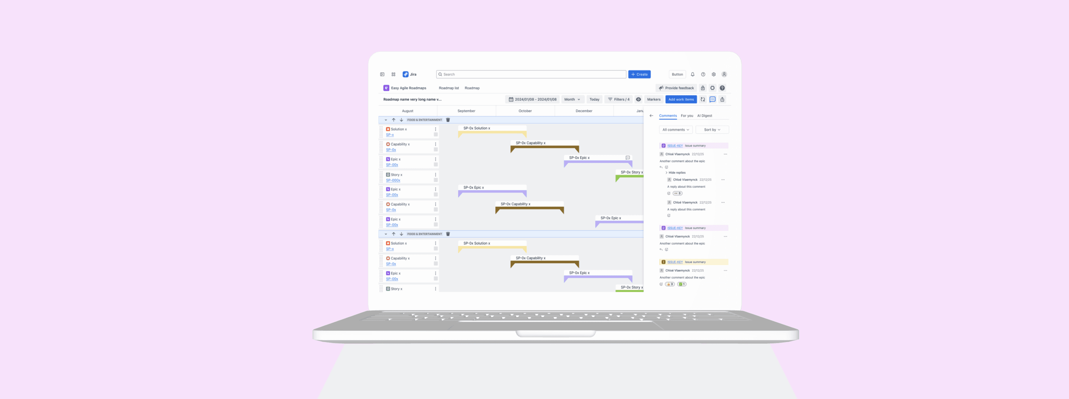
Easy Agile
Bringing collaboration into the roadmap
YEAR
2025 - 2026
TIMELINE
Ongoing
ROLE
End-to-end design lead, working with Engineering
SUMMARY
A collaboration layer for the roadmap
Easy Agile Roadmaps is a roadmap tool on Jira Marketplace. The roadmap was where teams planned but any actual conversation about it happened somewhere else. Questions went to Slack, emails and decisions got lost in emails. Nothing stayed with the roadmap. Roadmap comments fixes that by letting people comment directly on the items they're talking about.
IMPACT
Validated by research before it shipped
Delivery
100% of users
found and used the commenting interaction without guidance. Rated easy and useful during user testing
Scope
Only app of its kind
The only Atlassian Marketplace roadmap app offering commenting at both item and roadmap level in one experience.
THE PROBLEM
The roadmap was a one-way broadcast
Teams use Easy Agile Roadmaps to plan and present. But if a stakeholder had a question, they'd send an email or message in Slack. Decisions didn't stay with the roadmap. There was no record of why something landed in Q3, what concerns had been raised, or what got agreed in the last review.
Stakeholders had no way to engage directly. They'd have to find the right person or wait for a meeting. Their input existed outside the tool entirely.

MARKET POSITION
The only Atlassian Marketplace roadmap app to offer this
Easy Agile Roadmaps is the only app in the Atlassian Marketplace with commenting at both the item level and the roadmap level. Routemap has a basic panel at the roadmap level only. Jira Product Discovery has comments, but you have to leave the roadmap to use them.
It was a clear gap both for users and in the market, and the opportunity was to do it properly. Because comments are tied directly to items on the timeline, there's always visual context and you always know what you're commenting on.
THE CONTEXT
Building something from scratch
There was nothing existing to extend here. Comments was a brand new feature, which meant a lot of decisions to make from the ground up: where comments live, how you get to them, what you can do with them, and how they behave across different views.
I worked closely with the engineering lead to break the work into phases and agree on what went into each one. The PM had limited availability, so we figured out the sequencing together. It was a good partnership: I came in with the design, and we figured out the approach together.
💡
I expected we'd hit technical limits somewhere and provided less preferred design alternatives.
Engineering could build everything I'd designed, which meant I didn't have to cut corners on the experience. The phased rollout helped and each phase could be properly finished rather than rushed.
DESIGNING FOR
Two types of people, same roadmap
The feature needed to work for two different people with pretty different needs.
🧍🏼
Roadmap owners (PMs or team leads)
Want to add context to items, capture what was decided and why, and action or close out discussions without leaving the tool.
🧍🏼
Roadmap consumers (stakeholders, leaders, team members)
A vertical line marks the start date, with full colour fill only on hover. I also introduced view settings; a toggle panel for date and version markers. This pattern extended to other roadmap elements too.
RESEARCH & TESTING
Prototyped and tested with AI
I used Figma Make to build a working prototype quickly, then tested it through Voicepanel, an AI platform that recruited participants and ran the sessions without me needing to be there. Five people from Agile teams across different countries tested three tasks.
It was a fast way to get real feedback from real users. The results came within 24 hours.
👍🏻
5/5 users could add a comment
The hover-revealed comment icon was easily identified. The interaction felt clear and aligned with users' existing mental models.
👍🏻
5/5 users could find the centralised comments panel
Users deemed this panel useful. They also wanted to see comment status at a glance without opening each thread.
👎🏻
3/5 users found the AI functionality
2 of them couldn't find it. The overview section was seen as noise. Sentiment analysis and suggested actions were valued, but discoverability needs work.
👍🏻
AI expectations came unprompted
Several participants raised AI expectations before being asked. The expectation was clear: AI should be in context and not in a separate view.
THE SOLUTION
Comments where the work is
The design has three main surfaces: comments on individual items, a panel that shows all comments across the roadmap, and a "For You" tab that filters down to what's relevant to you.

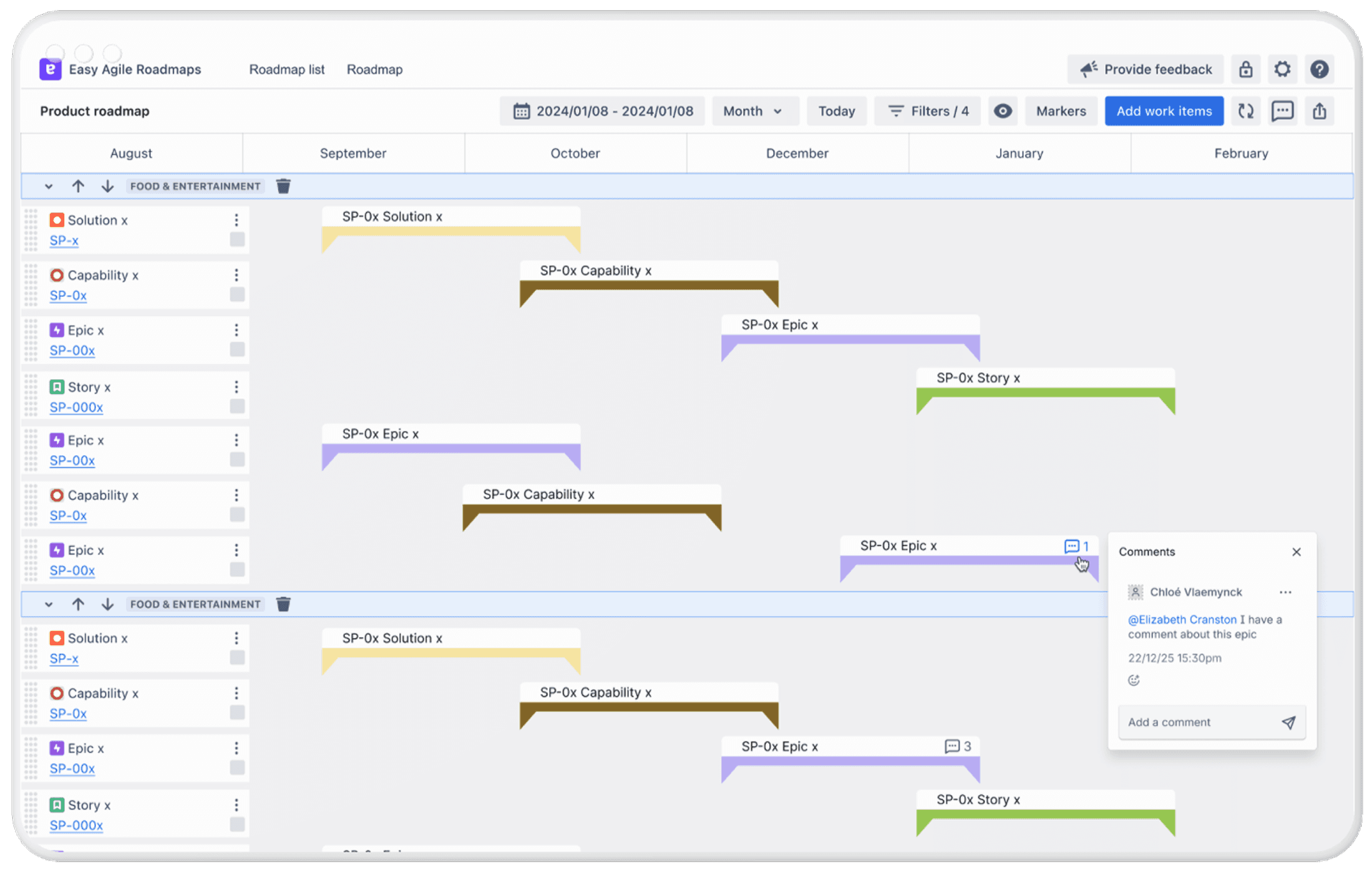
Item-level comments: accessed via a hover interaction on any roadmap card, anchored in place so users always know what they're commenting on.

The centralised comments panel: Comments, For You, and Insights tabs. All comments across the roadmap in one place, with filtering, sorting, emoji reactions, and inline replies.

The "For You" tab: filters down to comments the user has written or been @mentioned in, reducing noise for users who don't need the full roadmap view and making sure that relevant comments don’t get missed
Designing the details
One of the principles behind this feature was flexibility, I wanted comments to feel more like a whiteboard than a modal, so the experience could adapt to however someone was using the roadmap at that moment. That meant thinking through the edge cases properly.

These weren't dramatic problems to solve, but getting them right is what makes the difference between something that feels considered and something that feels half-finished.
AI FUNCTIONALITY
Useful where AI is actually good
AI is getting a lot of attention right now. But research was clear about where it actually helps: not in making decisions for people, but in saving them from having to read through everything to find the point.
The initial design placed AI in a dedicated Insights tab: a separate view with a sentiment summary, suggested actions, and a comments overview. The idea made sense in theory, but didn't hold up in testing.
👎🏻
Low discoverability
2/5 users couldn't find the Insights tab.
👎🏻
AI summary adds noise
The overview section was seen as noise. Participants expected AI to help them in context.
The final design includes:
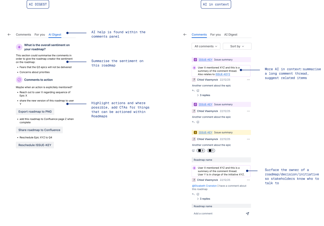
Summarising sentiment on the roadmap, based on comments. Are stakeholders feeling confident or skeptical?
Highlighting actions from comments. Have stakeholders for the roadmap to be shared anywhere? Does an initiative need reprioritising or sequencing?
AI in context: help users summarise a long comment thread, and understand related work items, or who owns the work/decision.
DELIVERY
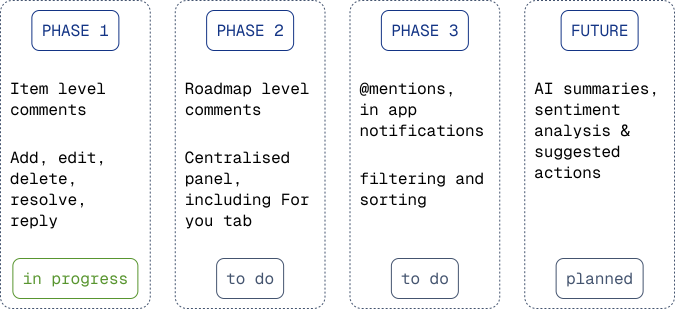
Shipping in three phases
I worked with the engineering lead to break the feature into phases. Each one ships something useful on its own rather than holding everything back until it's all done.
REFLECTION
What I learned
This was a project where I felt genuinely end-to-end: holding the product thinking as well as the design. Using Figma Make and Voicepanel to run unmoderated testing meant I had feedback from real users within hours, which kept things moving fast.
The decision I'm most glad I didn't walk back was the floating comments panel. Early on I questioned whether it was too ambitious but engineering didn't push back at all.
The part I'm still watching is the AI. I've never designed an AI feature before, and I want to make sure it actually adds value to users, not just ticks a box.